
NTLS Album Cover

Album for the self-titled NTLS debut album cover
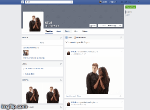
NTLS Website

Click on image to open the NTLS website
Tuesday 20 January 2015
Sunday 4 January 2015
Q1. In what ways does your product use, develop or challenge forms and conventions of real media products?
Within my project, my three media products use, develop and challenge the forms and conventions of real media products in a various number of ways. The products, a music video, a digipak album cover and a website, all use unique methods of reaching audiences and communicating information to them. A lot of influence was garnered from professional examples within the contemporary music industry and so I shall reference them alongside my analysis of each product.
Music Video
Our music video is a performance based video with a separate narrative running parallel.
Genre
Our track falls within the Electronic Alternative genre and in order to accurately reflect this, we followed the characteristics of established artists who also fall within the genre. This method also appeases Andrew Goodwin's theory on the genre characteristics within music videos, influenced via common themes, styles and iconography.
 A relatively new genre, most artists belonging to it are still on their way up. In order to survive such a saturated music industry the most popular of this genre have had to push a unique and inspiring style in order to get recognised. A prime example of this is FKA Twigs, who is perhaps more known for her eerie presence as a performer and sub-future, sub-tribal fashion with heavy urban elements. In order for our artist to survive, they must attempt to capture a similar abstract feel.
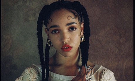 |
Representation
- Equality between the artist was of utmost importance, regardless of race or sex. This was a necessity as within contemporary Western societies, there are no clear boundaries of equality amongst either of these factors.
- Usually there is a lead individual within the band/artist so that the audience can develop a deeper connection with them, rather than attempting to do so with multiple people. In addition to this, the dominant individual is usually a white male. Both of these conventions are challenged by the fact that our white male artist is represented as completely equal to our black female artist. One simple way of achieving this equality is by giving both artists equal screen time and place them at an equal level, physically, within the video,
- A common occurrence amongst music videos, is that artists are sexualised in order to attract and sustain audience attention. In challenge to this, neither artists within our video is sexualised and instead both possess rather detached and indifferent personalities, creating a feel of mystery rather than shallow sexual interest.
Music Video
Representation
- Equality of artists and their represented demographics
^ White males usually most dominant with black/minority females least dominant
- Heavy representation of London
- Lack of sexualisation allowing audience to relate to them more and focus on unique characters
Genre Characteristics
- Goodwin' theory on character archetypes (?)
- Costume: influence from FKA Twigs and Telana
- Lighting: influence from AlunaGeorge and Telana
- Minimalist video style much like rest of mellow electronic music videos
Iconography and Visual Hooks
- Strauss' Binary opposites
- Richard Dyer's theory on construction of star image (unattainable)
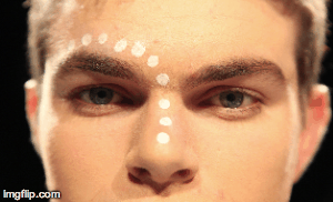
^ Relateable due to not being sexualised but makeup like the dots and majestic jewelry elevates artist
- Influence from FKA Twigs and AlunaGeorge
Intertextual Referencing
- London and VHS footage
^Ally Pally, Tower Bridge, Brick Lane, Shard, China Town, Central
^Fish and chips at local, travelling by tube
Performance and Narrative
- Split of performance and narrative footage
- Strauss' Binary opposites between performance and narrative
- Influence from "Chase & Status - Blind Faith" and "JUCE - Call You Out"
- Influence from "AlunaGeorge - Just a Touch"
- Todorov's narrative structure: Equilibrium > Disruption > New Equilibrium - subtly present in narrative
Lyrics, Music and Visuals
- Lyrics guide the video, as Goodwin's theory states, both structurally and for choreography
^ "You give me more" - Vivian, so Josh looks up in shot implying it's to him
- Influence from "Sam Smith - I'm Not The Only One" and "Flying Lotus - Never Catch Me"
- Carol Vernallis' theory on video matching song beat
- Influence from "Hot Chip - Ready For The Floor"
Editing
- Idea of breaking conventions to keep video interesting, in sync with Vernallis' theory
^ breaking 30degree rule and cutting on beat and off beat in a random way so it isn't predictable and boring
- Strauss' Binary opposites to keep it interesting
^ black vs white infinity backgrounds
^ performance footage vs narrative footage
^ HD camera vs VHS camera
Camera Framing and Movement
- Eye level to empower artists yet make them seem human and not sexualised
- Use of master shots in contrast with close ups (Vernallis)
- Creation of unique feel via framing
^ Unusually using ELS a lot to differentiate from other videos
Website
Website
Navigation
- In flow with our artist, as simple and easy to navigate
- Minimalist/contemporary feel, whilst still retaining maximum functionality
^ ie. buttons are stylised yet are still able to link you to external and internal pages
- Clear information for a mature audience
^ recognise that audience that visit site will be committed and want to the raw info, not glossed up info
- Influence from FKA Twigs, SBTRKT, George Ezra
Social Interactivity
- Social media icons act as button whilst being synergistic with website image
- Influence Lewis Watson
- Use of Twitter feed, YouTube integration, Facebook prompts and Soundcloud links
- Ability to purchase merchandise on website from the store page
Institutional Information
- Page devoted to the professional aspect of artist
- Contact page has all means of professional communication with embedded map of HQ
Brand Image
- Background is image of artist whilst conforming to heavy theme of NTLS - foliage
- Album Cover acts as homepage
- Artist posed with similar facial expressions and body language - staple of artist for video aswell
Album Cover
Synergistic Artist Image
The album cover packages not only the album, but also the core of the artist image, as is the convention for an artist's debut album. Much like other debut albums, the focal image on the front cover is of the artist.


Examples of well known debut albums from Dizzee Rascal, Ed Sheeran and Skee-Lo are just a few examples of debut albums with a focal image of the artist staring outwards.
Although we wanted to follow this convention in order to get our artist's image imprinted in the audience's mind, we needed to differentiate our album cover. This is the reason behind the merged and dotted faces. On a practical level it one of the few ways we could have combined two faces into a single head shot.
Album Cover
Synergistic Artist Image
- Captures completed artist image
- Focal image is used on website
- Background of front and back is similar background to website background
- Inside image is ripped from music video style with tweaked costume
- Behind disc image shows logo that appears in website for home page button and merchandise

Saturday 3 January 2015
Q2. How effective is the combination of your main product and ancillary texts?
A major goal of ours was to create a strong band identity via the creation of a sense of synergy amongst our main product ans ancillary texts. This would enable us to more easily attract our specific target audiences. In this post I will detail how we combined all of our texts into a united brand and how effective this combination was.
Identity
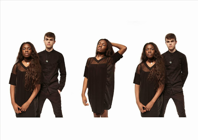
In keeping with Richard Dyer's theory of star image, the style of our artist was an intrinsic part of the identity of both our artist and brand image. The most effective way to convey the artist's image is via the use of costume and makeup. Costumes seen within the music, video, album cover shots and on the website all depict the artist in similar costumes which in turn conveys a consistent overall identity across all three texts.
The costume needed to provide us with a means of relating the artist to as large a potential audience as possible. Due to the fact that the male singer, Nathan, is black and that the female singer, Lulu is white, we had no issue of transmitting a signal that both race and gender were of no bias when it came to NTLS. However, age then came into question and we needed our audience members needed to be reached regardless of their age. Therefore, we came to the decision of attempting to make the costume elevate the artist to a more mature style, yet keep it's alternative roots. The maturity would appeal to an older audience as it would make the artist seem older and thus, more relateable. The alternative quirks would appeal to the entire audience base as an alternative nature is the very essence of our brand identity. Below is a diagram showing the reasoning behind each item of clothing that makes up the artist's base costume:


Music Video
The music video was the main product of the project. This is a result of the video releasing time with the artist's debut album, so the video provides the most depth in regards to NTLS' image, character and style. On top of this introduction of the artist identity, the music video deals with the genre, tone and themes of the artist's music. The main challenge that came with the music video was the balancing of a unique video that engaged the audience and the informative nature of a "debut" music video for an artist. In order to conquer this balance we needed to ensure that the visual style was consistent within the video, so that we could also transfer this somewhat rigid style onto our other products. Below is a gallery highlighting examples that are a result of this effort to be consistent:
Website

Album Cover
The album cover obviously has the job of appealing to the audience's eye, but arguably just as importantly, it needs to provide a taste for what the artist is all about, especially in regards to a debut album.
We spent a vast amount of our album cover time on the front cover as this was by far the most important side. It's what catches the audience's eye and can possess the most character of the artist. There are three aspects to the front cover, the graphic, the logo and the background. The background is a panoramic which spans round to the back, making it a major defining factor of the album and it's also synergistic with the website background. The NTLS logo appears all over the website and again in the interior of the album cover. The graphic is aspect that conveys the most information about the artist. What they look like and the creative tone of NTLS are connoted via this one graphic. The same graphic is also seen on the home page of the website. All of these aspects come together to anchor the artist's stylistic image and physical image onto the album cover.
Altogether, the three products and their synergy enabled me to reach our targeted audience by providing three different media products. Audience reach (accessing and attracting them) was achieved through the initial representation of the artist on the album cover and in the video, and by creating a visual representation of NTLS based upon audience expectations,we were able to appeal to them- with the website collectively combing all aspects of the band identity in detail.
Saturation of a logo was a vital aspect of the synergistic campaign. It would act as a representation of the brand when it wasn't appropriate for the artist themselves to be seen - on both the merchandise and website contact page for instance. If the audience could recognise the logo as being one and the same with the artist, then promotion of the brand would become a lot easier and efficient. Therefore, we tried to use the logo as much as possible in all three texts.
Synergy and Social Media

Physical albums have been driven out of the market on the most part, by the fairly recent development of online music consumption - by way of downloads or streaming. So, to combat this, the NTLS album is available on iTunes, Amazon MP3 and Google Play, three of the largest music download sites. Physical albums will still be produced, but the digital versions been there is more diversity in product and therefore more potential profits to be made.

Identity
In keeping with Richard Dyer's theory of star image, the style of our artist was an intrinsic part of the identity of both our artist and brand image. The most effective way to convey the artist's image is via the use of costume and makeup. Costumes seen within the music, video, album cover shots and on the website all depict the artist in similar costumes which in turn conveys a consistent overall identity across all three texts.
The costume needed to provide us with a means of relating the artist to as large a potential audience as possible. Due to the fact that the male singer, Nathan, is black and that the female singer, Lulu is white, we had no issue of transmitting a signal that both race and gender were of no bias when it came to NTLS. However, age then came into question and we needed our audience members needed to be reached regardless of their age. Therefore, we came to the decision of attempting to make the costume elevate the artist to a more mature style, yet keep it's alternative roots. The maturity would appeal to an older audience as it would make the artist seem older and thus, more relateable. The alternative quirks would appeal to the entire audience base as an alternative nature is the very essence of our brand identity. Below is a diagram showing the reasoning behind each item of clothing that makes up the artist's base costume:
Beyond just the costume, lies the more subtle decisions that went into makeup. One, less obvious defining aspect of NTLS, is the fascination with dots. They appear both in the makeup of the artist and the graphic that is seen on the album cover and website.
The dotted makeup itself was inspired by the convention found amongst other alternative artists to adopt an element of tribal tradition/culture in order to create a spin off
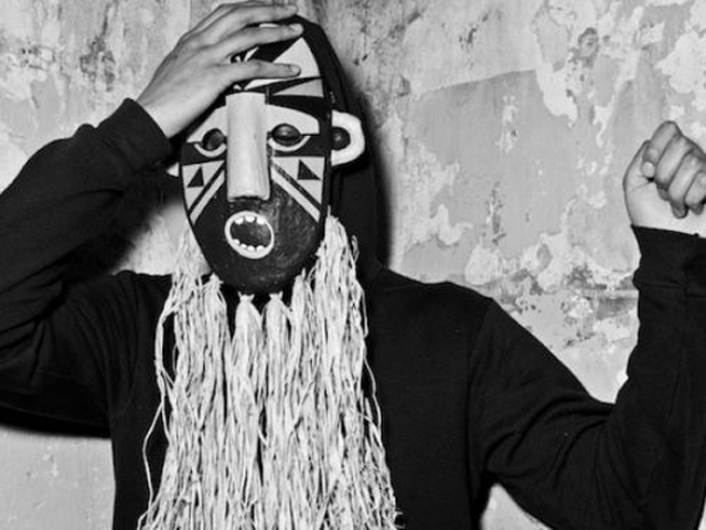 |
| A perfect example of this being SBTRKT's tribal mask which largely defined his physical appearance |
Alongside the artist identity, it was important to have a brand identity. This is achieved not only by the use of a a consistent artist physical image, but also via the use of a consistent product style. To ensure this, we would use the same or very similar images within all three texts and have the logo visible as often as possible. Below are a few examples of this synergy:
 |
Music Video
The music video was the main product of the project. This is a result of the video releasing time with the artist's debut album, so the video provides the most depth in regards to NTLS' image, character and style. On top of this introduction of the artist identity, the music video deals with the genre, tone and themes of the artist's music. The main challenge that came with the music video was the balancing of a unique video that engaged the audience and the informative nature of a "debut" music video for an artist. In order to conquer this balance we needed to ensure that the visual style was consistent within the video, so that we could also transfer this somewhat rigid style onto our other products. Below is a gallery highlighting examples that are a result of this effort to be consistent:
This style is then synergistic with the promo shots that we took for use on the album cover and website:
FKA Twigs has been successful in the creation of her recognisable yet growing identity. One staple of her identity is simply the colours blue and purple. They appear as the background for her album cover, her website and even her iTunes album section. Although we couldn't really exploit the idea at the same level of simplicity, we attempted to do so with the logo and merged face graphic. In addition to this, but to a lesser extent, the monochrome colour scheme and forest backgrounds are also staples of our brand identity.
 |
FKA Twigs' iTunes album section |
Website
The website is the hub of all things related to NTLS. It deals with content such as the two other main text (video and album) as well as more minor elements such as social media links for the individual artists and contact information. By functioning as the connection point for all of these features, the website is the flagship of the promotional effort created by the NTLS brand. It operates by using both below and above the line marketing.
The website was designed on the informed assumption that those visiting would have reached it via a direct search for the website in question. In consistency with the style of the brand, we wanted to keep it mature as this would limit lack of appeal to older audiences. Moreover, as the visitor is most likely a knowledgeable and committed fan, there is no need for shallow gimmicks on the website. Those who are visiting will want the information they're seeking to be easily accessible and readily available. Staying focused on this simplistic ethos will also mean that merchandise and event tickets should see a rise in sales as they are so clearly and informatively presented.
However, it is necessary that there is information that can be digested by the uninformed visitor who may have simply stumbled upon the website or because they had purchased the debut album without knowing the artist. This information takes the form of the about pages for both Lulu and Nathan, granting the visitor with a basic understanding of who's who and what NTLS is all about. This will then hopefully develop into the new visitor following the artists on their chose social media site and possibly contemplating the purchase of some merchandise or tickets.
Album Cover
The album cover obviously has the job of appealing to the audience's eye, but arguably just as importantly, it needs to provide a taste for what the artist is all about, especially in regards to a debut album.
We spent a vast amount of our album cover time on the front cover as this was by far the most important side. It's what catches the audience's eye and can possess the most character of the artist. There are three aspects to the front cover, the graphic, the logo and the background. The background is a panoramic which spans round to the back, making it a major defining factor of the album and it's also synergistic with the website background. The NTLS logo appears all over the website and again in the interior of the album cover. The graphic is aspect that conveys the most information about the artist. What they look like and the creative tone of NTLS are connoted via this one graphic. The same graphic is also seen on the home page of the website. All of these aspects come together to anchor the artist's stylistic image and physical image onto the album cover.
 |
| NTLS front cover |
Altogether, the three products and their synergy enabled me to reach our targeted audience by providing three different media products. Audience reach (accessing and attracting them) was achieved through the initial representation of the artist on the album cover and in the video, and by creating a visual representation of NTLS based upon audience expectations,we were able to appeal to them- with the website collectively combing all aspects of the band identity in detail.
Logo Saturation
Synergy and Social Media
After the artist identity had been clearly defined by the consistencies between the three texts, it was necessary to promote this idenitity within social media, in turn reinforcing a brand identity. The wesbite would also be the nexus for these third party sites, but these various sites were what created a substance to the artist via each sites content. Below is a presentation that delves into how the website acted as a hub and what the thrird party sites brought to the table, so to speak: [Please note that clicking on i in the slideshow was bring up an in depth description of each slide]
Record Label
The fictional record label, Red Pigeon Records, draws direct influence from real record labels focused on a similar alternative genre. The most major thing in regards to the record label was to stamp the logo wherever appropriate. This presents their contribution and also gives the NTLS image a professional feel to it.
The fictional record label, Red Pigeon Records, draws direct influence from real record labels focused on a similar alternative genre. The most major thing in regards to the record label was to stamp the logo wherever appropriate. This presents their contribution and also gives the NTLS image a professional feel to it.
Audience Reach and Communication
Reaching and communicating with your audience is the vital method of ultimately selling your profit creating products, which in turn leads to a successful campaign. Therefore, we had to carefully plan out various means of getting our products to reach our audience in order to ensure success.
Our website will be published onto the internet, as will our music video. The internet has a potentially limitless audience reach, with virtually every Westerner having daily access to it. In particular, the video is posted on YouTube, a video sharing website that has one of the highest traffic rates in the world. As a result of the scale of YouTube, we are essentially guaranteed to receive some attention, even just to the those who randomly stumble upon it via video recommendations.
Physical albums have been driven out of the market on the most part, by the fairly recent development of online music consumption - by way of downloads or streaming. So, to combat this, the NTLS album is available on iTunes, Amazon MP3 and Google Play, three of the largest music download sites. Physical albums will still be produced, but the digital versions been there is more diversity in product and therefore more potential profits to be made.
In regards to merchandise, we followed the trend of contemporary street designer wear, as well as styles of clothing produced in the name of similar artists. This makes the merchandise instantly appeal to those in our secondary target audience and to those who are interested in similarly styled street wear. This decision essentially guarantees audience consumption. Below is an example of the merchandise style:
Radio appearance
As a great way of exploiting below the line marketing, we turned to radio. It would raise NTLS' profile and cost very little, which is ideal. BBC Radio 1 was the ideal suitor as it has commonly dealt with up and coming alternative artists in the past. Below is an example of an interview that takes place on BBC Radio 1 and some screen grabs of their online presence:


As a great way of exploiting below the line marketing, we turned to radio. It would raise NTLS' profile and cost very little, which is ideal. BBC Radio 1 was the ideal suitor as it has commonly dealt with up and coming alternative artists in the past. Below is an example of an interview that takes place on BBC Radio 1 and some screen grabs of their online presence:
Friday 2 January 2015
Q3. What have you learned from your audience feedback?
Throughout the project, the audience, who is the consumer, was always at the forefront of our mind. If at any point we failed to appease or appeal to the audience, then the project as a whole would have failed. Within this post I shall detail how we ensured that this failure did not occur.
Primary Audience
Our primary audience are those who are fans of the Electronic/Alternative genre. This genre in particular is booming within the UK and specifically, London, music industry so we thought it would be easy to gain a lot of traction within this community.
Secondary Audience
Our secondary audience are late teen to young adults (roughly 16-24) as they are the most active music consumers for both all music and for this genre in particular. Therefore, targeting this age bracket will likely result in a guaranteed level of consumption to some extent.
Tertiary Audience
Our tertiary audience range within the mid 30s to mid 40s age bracket. This is due to our song's mellow tone and could fit well with older listeners who have been used to less boisterous music for a while now. In addition, the themes present within the song could incite a nostalgic reaction, which would only be beneficial.
Theory
We integrated Blumler and Katz' "Uses and Gratifications Theory" into our construction of the three texts. Blumler and Katz argue that in order for the product to be a success it must enable at least one of four outcomes when consumed by the audience. Below is a grid explaining the four factors and how we attempted to achieve them:
 |
At each stage of the project we gathered audience feedback in order to ensure that the products we were creating would stay in line with the audiences' desires.
Research and Planning
Music Video
As a means of documenting and presenting our ideas on narrative and performance, we made both an animatic and a steal-o-matic. These would act as a visual guide for when it came to actually constructing the video. On top of this, we would be able be to receive feedback on our ideas that are depicted b#via the animatic and steal-o-matic, providing us with a clear direction of what needs to be done from very early on in the project.
We setup small informal screenings of both the animatic and steal-o-matic for our target audiences. To our relief, the audience was very impressed with the idea of a VHS and HD split and thought that it would be clear enough as to what was going on. This was great news as this split was our primary unique selling point. On the whole, they felt that the animatic needed to depict the archive footage in a way other than simply a black screen as it interrupted with their suspension of disbelief. And so, we created an updated version of the animatic:
The screening group thought that the overall narrative structure worked well, but in order to ensure that it flowed well, we would need to toy with cuts, music and visuals more in order to avoid becoming boring. We utilised this advice heavily when it came to the editing process.
Website
Our first draft of the website was focused around the album cover's focal image as this was the convention for the Electronic/Alternative genre. Below is a screenshot of our website draft in Wix:
More importantly than the fact that it's a convention, the audience were really supportive of the idea of having the website's focal image being the same as the album cover. So, we kept it and would work towards developing it rather than coming up with another idea.
Album Cover
We showed some members of the target audience the panoramic plan for our album cover and recorded their feedback:
Below is the feedback from a member of our primary target audience:
When asking member of our secondary target audience, they agreed with what our primary audience said - that the artist image wouldn't be strong enough with the current panoramic idea. We then agreed that we needed to have a bold focal image of our artist's face for the front cover in order to really anchor their identity within the album. So, we then set out to make some concept sketches of a focal image graphic which merged the artist face in a unique manner and showed that to our audience to receive feedback:


Below is a video showing the feedback we received from members of our primary and secondary target audiences who had been informed of the developments since the animatic:
Our first draft of the website was focused around the album cover's focal image as this was the convention for the Electronic/Alternative genre. Below is a screenshot of our website draft in Wix:
 |
Album Cover
We showed some members of the target audience the panoramic plan for our album cover and recorded their feedback:
 |
| Panoramic concept |
Below is the feedback from a member of our primary target audience:
When asking member of our secondary target audience, they agreed with what our primary audience said - that the artist image wouldn't be strong enough with the current panoramic idea. We then agreed that we needed to have a bold focal image of our artist's face for the front cover in order to really anchor their identity within the album. So, we then set out to make some concept sketches of a focal image graphic which merged the artist face in a unique manner and showed that to our audience to receive feedback:


The circle design was much preferred to the square design, but as an entire idea, the concept went down very well with the audience.
Construction
Music VideoBelow is a video showing the feedback we received from members of our primary and secondary target audiences who had been informed of the developments since the animatic:
From the screening shown above, along with unrecorded comments, we gathered numerous points of direction and criticism:
Everyone seemed to agree that the VHS and HD footage combination works really well and that it genuinely gives off an alternative feel within the video, in keeping with our actual genre of Alternative/Electronic.
The editing style of the studio was widely praised as it kept the audience's attention with the rapid and unexpected cuts, which have been clearly inspired by Carol Vernallis. However, in regards to the VHS footage, the editing isn't as strong due to the lack of syncing with music. This shows the awkward reality of how the video was attempting to dominate the music, when it should be the other way around. This needed to change.
On a lesser note, some members of the audience thought that there should be less narrative relative to performance footage. This is especially true in regards to the end of the video when there is barely any screen time for the artists in the studio. This needed to be fixed as the artist should take precedence over the video's narrative.
We were critiqued quite frequently on the narrative progression surrounding the couples relationship, saying that it was quite weak and didn't have a clear ending. To change this, we rearranged some VHS sequences to create a clear beginning middle and end. We also filmed an extra scene to conclude the video
A fairly concerning piece of feedback was that the narrative progression didn't excel at showing the couples relationship develop and fall. This in turn resulted in a weak and disappointing end to the narrative. In order to combat this, we completely re-shot the final scene of the narrative.
A fairly concerning piece of feedback was that the narrative progression didn't excel at showing the couples relationship develop and fall. This in turn resulted in a weak and disappointing end to the narrative. In order to combat this, we completely re-shot the final scene of the narrative.
Using this feedback, we revised and updated the edit and then showed the new version to our audience again, in order to see if the changes were successful:
This feedback gave us confidence that the narrative and performance combination was very successful. The audience were able to suspend their disbelief and build a connection with the characters of the story even though the video itself was 3 minutes long. Many commented on the unique and engaging style which was another major success. Overall, I am very pleased with the positive manner in which the audience viewed the music video.
Album Cover


Website
 By distributing links via email and holding reviewing sessions, we were able to receive feedback for our website during the construction phase. The website was taken with positive feedback on the whole, particular praise was given to the about pages.
However, a piece of reoccurring criticism was that the tour page and contact page were too bare, with little connection to the artist. In direct response to this, we added a live twitter feed of NTLS and promotion for their BBC Radio 1 appearances, which also displayed symbiosis with companies that our target audience was equally recognise and appreciate.
Evaluation
Music Video

Album Cover
We got together a focus group of people from our primary, secondary and tertiary audience in order to gather feedback about our album cover. Below is a response from each audience category:
The feedback was overwhelmingly positive, with the audiences saying we had created a powerful and clear album cover that was noticeably synergistic with our other two texts.The only slight room for improvement was the possibility of having lyrics to songs somewhere on or within the album cover.
Website
We then went on to do the same for feedback on our website:
Again, the feedback was overwhelmingly positive. In particular, the "About" page was very popular as it acted as a personal and honest into the artist's character, keeping in tune with the very individualistic nature of the Alternative/Electronic genre. The audience stated that the synergy with the other texts was very clear and that the interactivity of the website kept them engaged. A possible improvement that was suggested was having a few more varied pieces of merchandise, such as a top with the merged face graphic printed on it.
Album Cover
Website
However, a piece of reoccurring criticism was that the tour page and contact page were too bare, with little connection to the artist. In direct response to this, we added a live twitter feed of NTLS and promotion for their BBC Radio 1 appearances, which also displayed symbiosis with companies that our target audience was equally recognise and appreciate.
Evaluation
Music Video
 |
| The majority of the people we asked thought the video was clear and engaging |
 |
| It was extremely reassuring to see that 100% of those asked felt it fell under the alternative, electronic or the indie genre. Thisgave us confidence that we producing a video that truly reflected our genre |
Album Cover
We got together a focus group of people from our primary, secondary and tertiary audience in order to gather feedback about our album cover. Below is a response from each audience category:
The feedback was overwhelmingly positive, with the audiences saying we had created a powerful and clear album cover that was noticeably synergistic with our other two texts.The only slight room for improvement was the possibility of having lyrics to songs somewhere on or within the album cover.
Website
We then went on to do the same for feedback on our website:
Again, the feedback was overwhelmingly positive. In particular, the "About" page was very popular as it acted as a personal and honest into the artist's character, keeping in tune with the very individualistic nature of the Alternative/Electronic genre. The audience stated that the synergy with the other texts was very clear and that the interactivity of the website kept them engaged. A possible improvement that was suggested was having a few more varied pieces of merchandise, such as a top with the merged face graphic printed on it.
Thursday 1 January 2015
Q4. How did you use new media technologies in the construction and research, planning and evaluation stages?
With this post I will detail and critique the technology which we used throughout the project in a somewhat chronological order.
Research and Planning
Social Media and Web 2.0
 Facebook was vital in the sense that it was a platform for us to organise the project as well as share and document ideas within the group.
Facebook as a communicative tool, was extremely useful. We could upload images in a private group, comment on them and debate the success of each individual shot very easily. Another valuable feature was the group chat, which game with a "seen" function. We could discuss ideas and see see who within the group had seen what content, whether in a chat or an image. This enabled us to keep up to date with who knew about what decisions etc.


YouTube was a useful means of researching other videos, as well as archiving points of reference. We used the playlist function to gather a list of inspirational videos which could end up influencing our project in the future. This allowed everyone within the group to easily access these points of reference and to update it for everyone else to see.


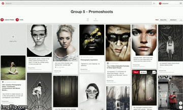
Pinterest was a very useful tool. We collected inspirational photos and images for styles, locations, makeup, costumes, hair and visuals. Then, we would store them (or 'pin' them) on Pinterest so that we could access them whenever we anted to and update the list whenever we wanted. It was really useful for sharing and discussing ideas as well as acting as an archive of previous points of reference.

Google Hangouts was a primary means of real time communication for when we weren't in school. Google Hangout lets you video call in a group as so we used it to discuss ideas develop the project with visual aids shared via our webcams.

Mobile Phones
Our phones were our primary source of communication with each other. We had all the previously mentioned apps on our phones in addition to the obvious features of messages and calls. Therefore, our phones were out go to piece of technology for organising meetings, screenings and quickly discussing aspects of the project.
We also used our phones as a means of capturing evidence in the form of photos and videos. We could then store them on our phone and share them via the aforementioned social apps. Due to the lack of setup timer and ease of access, we used our phones for filming a few spontaneous test shoots here and there. Below are a few examples of evidence captured from our phones:

Construction - Production
Canon 5D MKII
Our designated camera for the project was the Canon 5D MKII. We used to it to record studio footage because of it's high quality recording ability and professional industry standard. It was very much HD, recording in 1920 x 1080p with a 16:9 aspect ratio. It also allowed us to change settings such as ISO, exposure and zoom, which was vital for capturing an authentic looking infinity code background.

Leapfrog Lighting Desk
The school's studio has a Leapfrog Lighting Desk that allows us to create a very professional look as seen in our video. Numerous Arri 1000K Lights are at the control of the Leapfrog Lighting Desk. The Desk can alter the angle, intensity and target radius of each light.
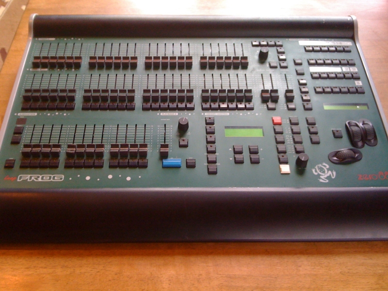
One problem we had with the lighting was having to re-position the rigs before every studio session. As we were sharing the studio with other groups, we had to move the lights before each shoot, as different groups had different lighting set ups. This meant a lot of time was wasted, however this was unavoidable. The desk did prove useful for this instance though as it allowed us to save lighting colour setups, cutting the time wastage.
Mobile Phones
Mobile phones were an essential part of the evidencing process, as they were the most convenient and accessible tool at our disposal. We also used them as a means of documenting shoot boards and shoot schedules which was a great way of staying organised both in and out of school at all times.
| We were then able to send saved photos and files to one another's phone |
Construction - Post Production
Adobe Photoshop
Adobe Photoshop was our go to application when it came to the design of the album cover. It gave us the ability to deal with multiple layers and the necessary tools to compose the images in a professional manner.

The merged face graphic was a challenge to create. It was very complex in the sense that there were multiple images layered upon one another. We had to use a clipping mask to then cut out sections for certain layers in order to slot them into the necessary position. We eventually managed to produce a sleek graphic that we were proud of.


Photoshop became extremely useful when it came to editing the many promotional shots that we had taken, both on and off site. There were a few small tasks that had to be completed on each shot, such as editing out the line where the curtain hit the floor and removing shadows on the backdrop. Below is quick example of some of the minor tasks that needed to be done:
Because the shots were taken in different matches across many different shoot days, the lighting setups where never going to be completely the same. Therefore, on the odd occasions we'd have to adjust settings such a brightness, contrast and saturation in order to get each shot looking consistent with one another.

Difference between full colour (unedited) and monochrome (edited)
Photoshop was also the platform that we used for creating the merchandise of our store. It was a simple process. We'd take plain coloured piece of merchandise from a real retailer website and simply superimpose the logo onto said item of merchandise, essentially branding in NTLS.


Adobe Illustrator
The NTLS logo was first drawn by hand, but we needed to translate that drawing into a digital file. We used Adobe Illustrator to trace the image of the scanned in drawing and make it presentable as a digital file.

To edit our footage we used Adobe Premiere Pro. It allowed us to edit the footage in layers and edit in any order we saw fit.
 |
| Timeline for edit |
On top of the standard editing techniques used for the timeline, we used some of the editing tools to alter the framing or speed of shots. Where shots were too wide, we cropped the image by using the scale tool to increase the zoom, then the positioning tool to change its position in the frame. If a shot was too fast, we slowed it down using the speed duration tool.


Adobe After Effects
We did not originally intend to have to grade in Adobe After Effects but because of problems that arose with our footage we were forced to in the end. Some shots in our music video were too over exposed and the editing software within Adobe Premiere Pro did not allow us to correct it. To fix this problem, we had to open said shots in After Effects, which allowed us to isolate specific colours, which wasn't difficult luckily.
Within After Effects, we utilised a plugin called Color Finesse 3

The interface for Colour Finesse was a lot more complex than ProcAmp or Threeway-Colour-Corrector, but it didn't take long to learn how to use, as the principals of using sliders to change certain aspects of the image were the same.


We downloaded Honestech as a means to capture the footage from the VHS camera. Because of the nature and age of the camera, this external software was not already present on our editing suite as the school could never have predicted we would have needed it. The software was were simple and easy to use, allowing us to format the VHS footage into one that could be edited into the final cut of our music video.
The VHS camera itself was also very easy to use but due to the fact we were recording footage on analogue we had to be careful not to film over any previously captured footage. Unfortunately, the camera was quite old and as a result, fairly battered as well. Consequently the battery life wasn't as strong as it was meant to be.
Two major hindrances with the VHS camera is that it shot in 4:3 and not 16:9 as well as the fact that it automatically left a watermark of the date on the footage, which could not be removed. However, we were able to crop the frame dimensions in post production, thus rectifying the problems.


The black bars and box around the images are a result of the VHS filming in 4:3

An example of the video watermark showing the date we filmed the footage
Social Media and Web 2.0
We thought it necessary to integrate various social media links within our website in order to increase the level on interactivity the audience had to toy with. We created a Facebook Page, a Twitter page and an Instagram page. We uploaded as often as possible on each one to achieve an authentic feel and made sure to post images and details about upcoming moments of interest. In addition, we harnessed some synergy between the social media sites themselves; for example, posting links to our newly uploaded Instagram photos, on Twitter.
Evaluation
Social Media and Web 2.0
Collecting tick box and written responses from a wide range of anonymous people wouldn't have been possible without SurveyMonkey. The website allows you to create surveys that are very easy to give feedback on, even for those technically lacking on computers. The fact that it was anonymous meant that more people would be willing to participate and that those involved wouldn't feel pressured into giving us overly positive feedback. We were able to ask both qualitative and quantitative questions in order to receive the most in depth date possible.


Once we had created the surveys, we all posted the links to survey onto our Facebook walls, where each of us has at least 500 friends, leading to a somewhat guaranteed reach of 200 people each.

Mobile Phones
Although a more minor role, we used our mobile phones to record interviews / audience feedback and then would later upload it to either SoundCloud or YouTube.

Subscribe to:
Posts (Atom)